Build Your Wellness App Faster with This UI Kit
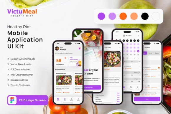
Imagine having a blueprint for your mobile application before you even sketch the first wireframe. That's the promise of a well-crafted UI kit, and for anyone diving into the health and fitness space, the Diet Planner App Mobile UI KIT is a game-changer. It's not just a collection of screens; it's a foundational design system that saves you weeks of work, letting you focus on what truly matters: creating an intuitive, engaging experience for your users.
A Visual Foundation for Health-Focused Brands
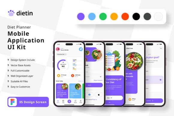
The core appeal of this kit lies in its visual coherence and modern aesthetic. With 35 pixel-perfect screen designs, it provides a complete journey for the user—from onboarding and goal setting to meal tracking and progress visualization. The templates are built with clean lines, ample white space, and a color palette that feels fresh and motivational. This isn't just about looking good; it's about creating a visual language that communicates trust, clarity, and support. For a brand in the wellness sector, this visual consistency is critical. It builds immediate recognition and helps users feel confident in the app's professionalism.
Practical application extends far beyond a standalone app. The 80+ UI elements included—buttons, input fields, cards, charts, and icons—are versatile design assets. A small business owner creating a meal prep service could use the shopping list or recipe card components to design compelling social media graphics or a section of their website. A content creator focusing on nutrition could adapt the progress tracker visuals for a blog post infographic or a printable planner. The fully editable vector layers in Figma mean you're not locked into the original design. You can easily change the color style to match your existing brand identity, swap out icons, or adjust typography to better reflect your voice.
From Template to Tangible Project: Real-World Uses
Let's break down how this translates into actionable projects. If you're a designer or entrepreneur, the kit accelerates your workflow dramatically. Instead of starting from scratch, you're assembling and customizing a proven structure. This is invaluable for:
- Rapid Prototyping: Quickly mock up a client's fitness app idea to secure funding or stakeholder approval. The high-fidelity screens make the concept feel real and immediate.
- Marketing Campaigns: Extract elements for digital ads, email headers, or Instagram stories. A beautifully designed calorie counter or macro chart can become a standalone piece of content that educates and engages your audience.
- Packaging & Print Collateral: The clean, modern typography and iconography work well on product labels for health foods, supplement bottles, or even workshop invitations. The scalable vectors ensure crispness at any size.
- Digital Products & Merchandise: Adapt the motivational quotes or progress visuals for printable planners, desktop wallpapers, or even designs for t-shirts and water bottles sold through an online store.
The key is to see the components as a library of visual solutions. That "Add Meal" button isn't just for an app; it could be a call-to-action on a landing page. The weekly summary chart isn't just for tracking; it could visualize data in a quarterly business report for a wellness brand.
Making Smart Design Choices with Your Assets
Having a powerful tool is one thing; using it effectively is another. Here’s how to get the most out of a resource like the Diet Planner App Mobile UI KIT:
- Start with Strategy, Not Screens: Before you dive into Figma, define your project's goal. Are you building a companion app for your yoga studio? A lead magnet for your nutrition coaching business? Knowing the purpose will guide which templates you prioritize and how you customize them.
- Typography is Your Voice: The kit includes free fonts, but don't hesitate to explore. Pairing the clean sans-serif used for data with a complementary serif or a subtle script font for headings can add personality. Always test for readability, especially for data-heavy screens like meal logs. The goal is clarity, not just style.
- Color Psychology Matters: The default palette is likely designed for energy and freshness. When you customize, consider the emotional response you want. Greens and blues often convey health and trust, while oranges and yellows can feel energetic. Ensure your chosen palette has sufficient contrast for accessibility.
- Layer and Combine Thoughtfully: The "Fully Layered" feature is a superpower. You can hide elements, rearrange sections, and combine components from different screens. Maybe you love the profile screen from one template but the dashboard from another—blend them to create your perfect layout.
Beyond the Download: Licensing and Final Polish
Always remember that the preview images are for demonstration only. The actual deliverable is the Figma file containing the editable vector templates and assets. A critical, often overlooked step is reviewing the license. While the fonts and icons are included for use within the kit, verify their licensing for your specific commercial project, especially if you're creating merchandise or digital products for sale. Most quality kits like this are designed for commercial use, but due diligence is part of professional practice.
Ultimately, a resource like this is about empowerment. It removes the intimidating blank canvas, providing a professional scaffold to build upon. Whether you're a solo entrepreneur launching your first health app, a marketer creating a campaign for a fitness brand, or a designer looking to streamline your process, it offers a tangible shortcut to high-quality, cohesive design. It allows you to invest your creative energy in innovation and user experience, rather than reinventing fundamental UI patterns. The result? A more polished, professional, and engaging product that resonates with your audience and stands out in a crowded market.