Design a Wellness App Faster with This UI Kit
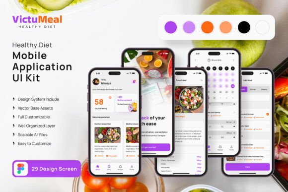
You have a brilliant idea for a health and wellness application. Maybe it’s a meal planner, a calorie tracker, or a mindfulness guide. The vision is clear in your head, but the execution feels daunting. Starting from a blank canvas in your design software can stall a project before it even begins. This is where a comprehensive design asset like the Healthy Diet App Mobile UI KIT becomes a practical solution for designers, entrepreneurs, and developers alike.
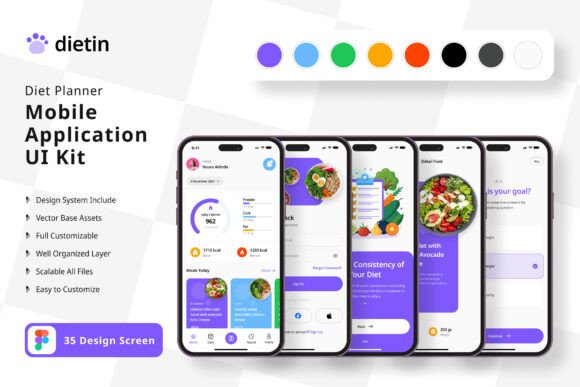
This collection provides a substantial library of 45 pixel-perfect screen designs, offering a robust foundation for your mobile application. Instead of spending hours aligning buttons, choosing color palettes, and designing basic navigation flows, you can focus on what makes your app unique. The kit is built in Figma, a leading tool for collaborative design, and it’s fully editable. This means every element, from the color of a progress bar to the style of a nutritional icon, can be customized to fit your specific brand identity and user experience goals.
More Than Just Screens: A Toolkit for Visual Consistency
A strong mobile application isn’t just a series of isolated screens; it’s a cohesive experience. The Healthy Diet App Mobile UI KIT includes over 80 individual UI elements, ensuring you can maintain a consistent visual language across every interaction. Consistency is key to building user trust and brand recognition. When a user sees the same button style, typography, and iconography throughout the app, the experience feels professional and intuitive.
This kit’s components are designed with modern typography and clean aesthetics in mind. The included free fonts and icon vectors are chosen to support readability and a contemporary feel, which is essential for health-focused applications that need to convey clarity and trust. The 100% vector layers and scalable vectors mean your designs will look sharp on any screen size, from a small smartphone to a high-resolution tablet, which is a critical consideration for web design and cross-platform development.
Practical Applications Across Your Projects
While its primary purpose is mobile app design, the value of a high-quality UI kit extends into numerous other creative and commercial projects. The principles of good design—clear hierarchy, balanced composition, and thoughtful color use—are universal. Here’s how you can leverage these design assets beyond the initial app mockup:
- Brand Identity Development: Use the color schemes and typography as a starting point for a full brand identity. The clean, healthy aesthetic can inform your logo design, business cards, and overall brand guidelines.
- Marketing & Social Media Graphics: Create cohesive social media posts, stories, and advertisements for your app or wellness brand. The consistent style will make your content instantly recognizable in a crowded feed.
- Packaging Design: If you’re launching a related product, like a health food line or supplement, the visual language from the app can translate beautifully to packaging design, creating a seamless connection between your digital and physical presence.
- Website & Blog Design: Use the UI elements as inspiration for website layouts, especially for landing pages, dashboards, or blog templates focused on health, fitness, or nutrition content.
- Digital Products & Print Materials: Design e-books, meal plan PDFs, workout guides, or even merchandise using the same visual consistency. The vector icons are perfect for scalable print materials like posters or invitations for a wellness event.
Streamlining Your Design Workflow
For small business owners and solo entrepreneurs, time is a precious resource. This UI kit acts as a powerful accelerator. You don’t need to be a seasoned graphic designer to assemble a professional-looking app prototype. The structured layers and symbol objects in Figma allow for quick customization. You can easily swap out placeholder images (note: the download includes the designs, not the preview images) and adjust text to reflect your content strategy.
This approach also supports better collaboration. When you hand a designer or developer a structured Figma file with clear components, the communication is clearer, and the development process is smoother. It reduces guesswork and ensures the final product matches the approved design vision, saving time and revision cycles. It’s a practical example of using premium design assets to achieve a professional presentation without a premium budget.
Choosing and Adapting Your Design Foundation
When integrating any design asset, thoughtful adaptation is crucial. Don’t just accept the defaults. Use the kit as a starting point for exploration.
First, define your project’s core personality. Is your app energetic and motivational, or calm and supportive? The base styles in the kit can be adjusted. A warmer color palette might evoke comfort, while a cooler, high-contrast palette can feel more clinical and data-driven. The ease of changing color styles in this kit makes this experimentation straightforward.
Next, consider your audience. Readability is paramount. Test the included font styles at different sizes to ensure they are legible for all users, especially for critical information like nutritional data or instructions. The sans-serif fonts included are generally excellent for screen readability, but you might pair them with a complementary serif font for editorial layouts or longer-form content within the app.
Finally, ensure commercial licensing aligns with your plans. The kit specifies that fonts and icons are free, which is a significant advantage for commercial projects. Always double-check the license for any third-party assets you choose to add, ensuring your final product is fully cleared for distribution. This careful attention to detail prevents legal headaches down the line and is a mark of a professional creative process.
By starting with a solid, customizable foundation like the Healthy Diet App Mobile UI KIT, you empower yourself to move quickly from concept to a tangible, high-quality prototype. It’s about working smarter, leveraging proven design patterns, and focusing your creative energy on the unique value your application will bring to its users.